Adv Problems in Graphic Design 1, Fall 2022
The goal was to analyze the usability of the University of Missouri - St. Louis website through field studies of students attempting a simple task: navigating from the UMSL home page and attempting to check out a book, Trevor Noah’s Born A Crime. My second task was to improve the present checkout flow for UMSL Library.
I went through each step in the UI/UX journey, breaking down pain points and boosting existing elements to give the library website a much needed facelift. This included things such as visual reworks, accessible language, and a smoother information flow.
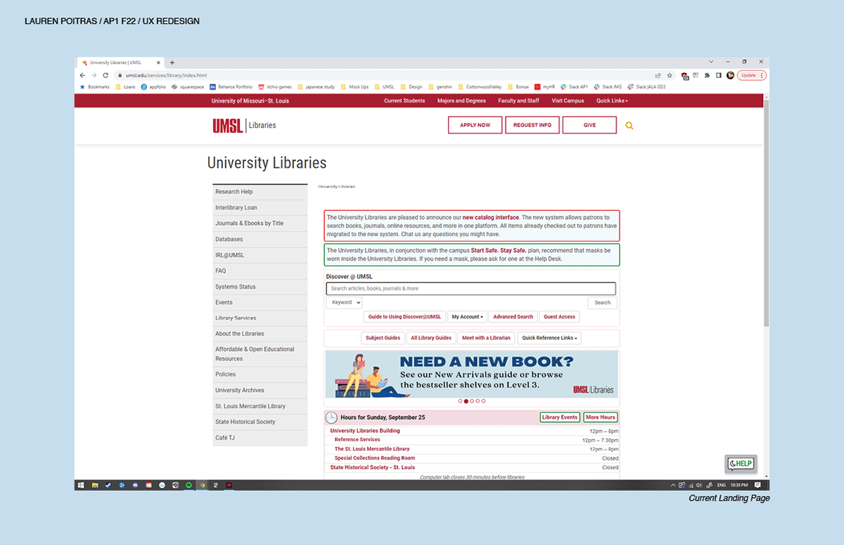
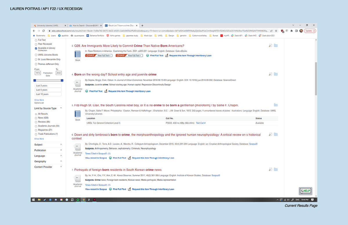
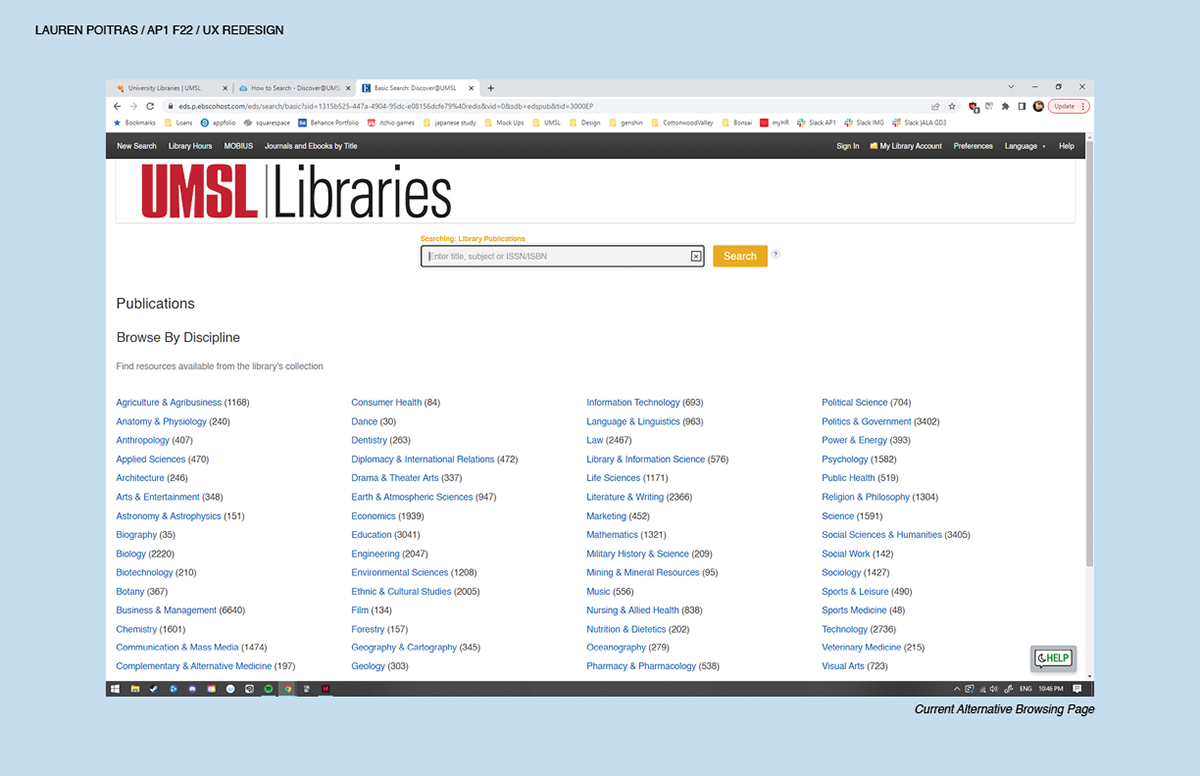
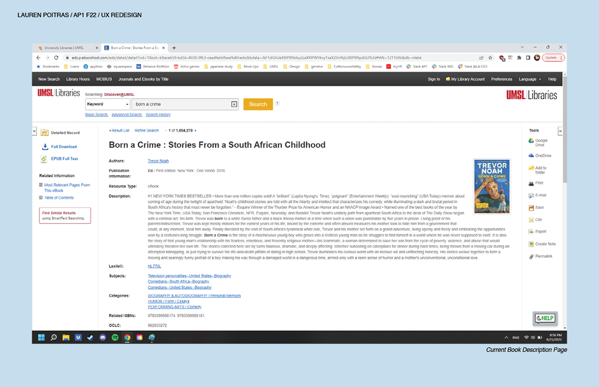
Initial observations begin with the current state of the website. It regularly overloads the user with information on
screen and navigation quickly becomes a big issue. Throughout the search multiple new tabs are opened up due to
redirects. Pages sometimes have information on different portions of the page rather than one localized area for things
like the search bar or book details. There is a lack of consistent functionality and visual hierarchy.
User Profile - In this scenario, I tasked Sam, a current UMSL student, to navigate the library to reserve a
physical copy of a specific novel: Trevor Noah's Born a Crime.
physical copy of a specific novel: Trevor Noah's Born a Crime.
Empathy Map - Most emotions that Sam felt were negative. He worked through multiple attempts to achieve his goal; however, he gave up in the end. Most of his frustrations were focused during times of redirecting or flipping through pages, unsure of where to go next.
As Is Scenario - Each purple box is an indicator of Sam clicking a new page or link. His total steps were then broken down into 8 main phases. His experience through the UMSL Library catalogue was overly drawn out and complicated.
User Journey Needs - Sam is a commuter student who needs access to the online library database from a home computer. His at home computer is slow and outdated, for this he desires an easier to navigate website to sift through on his current tech. Redirects bog down the interface and cause confusion when sorting between tabs. Flow of check out should be smooth and clearly directed.
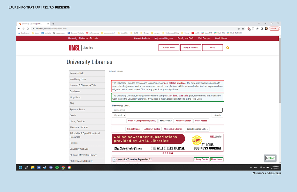
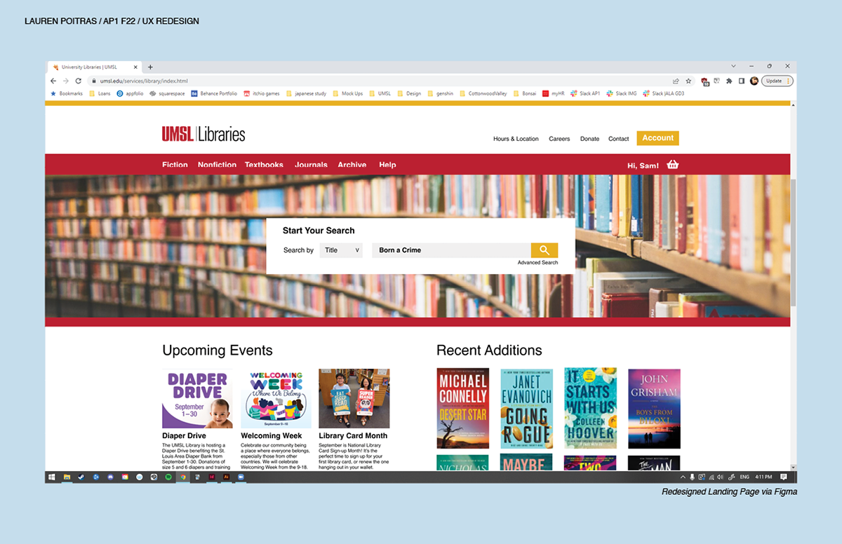
Left is the current state of the library website. Right is my projected redesign outcome.
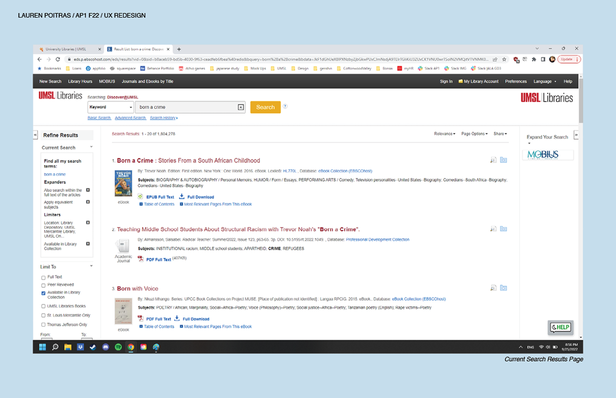
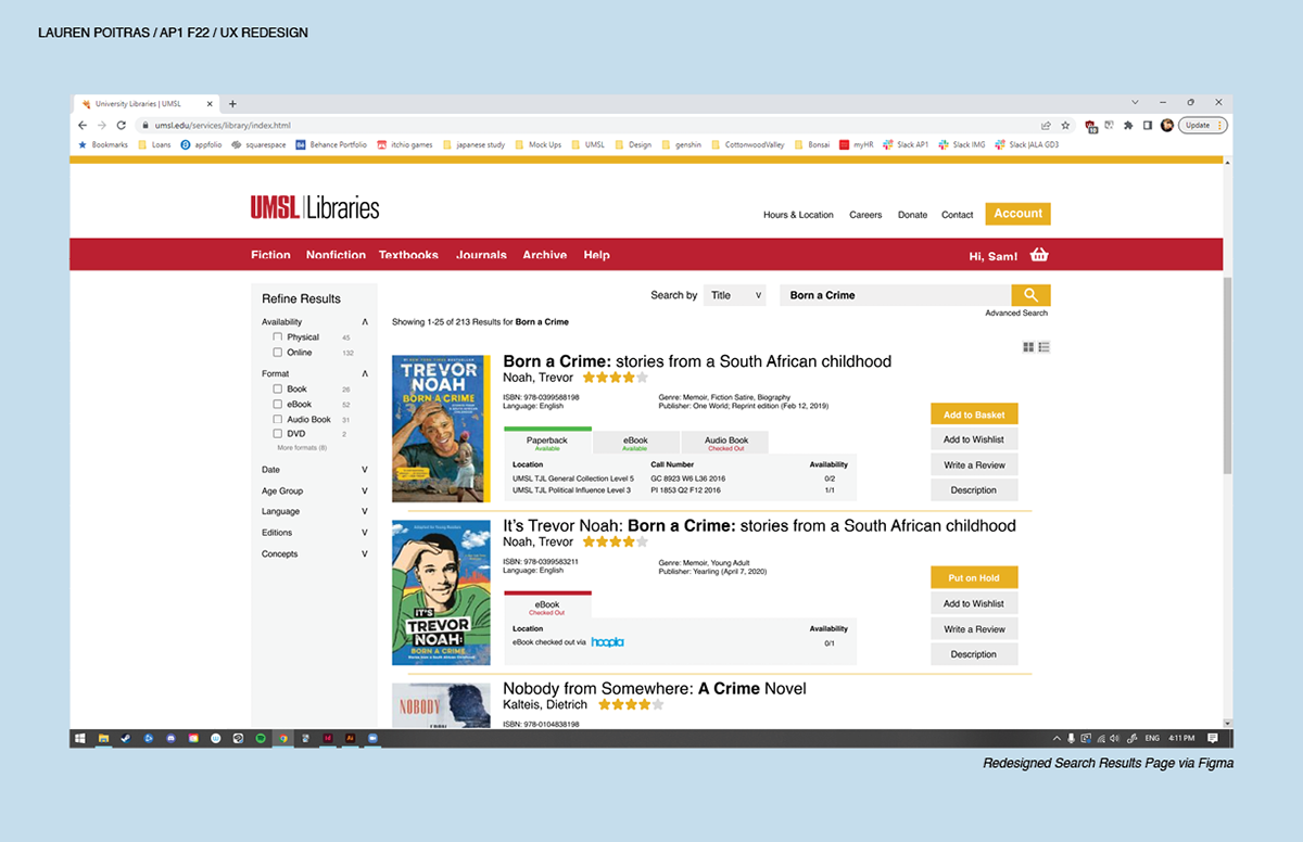
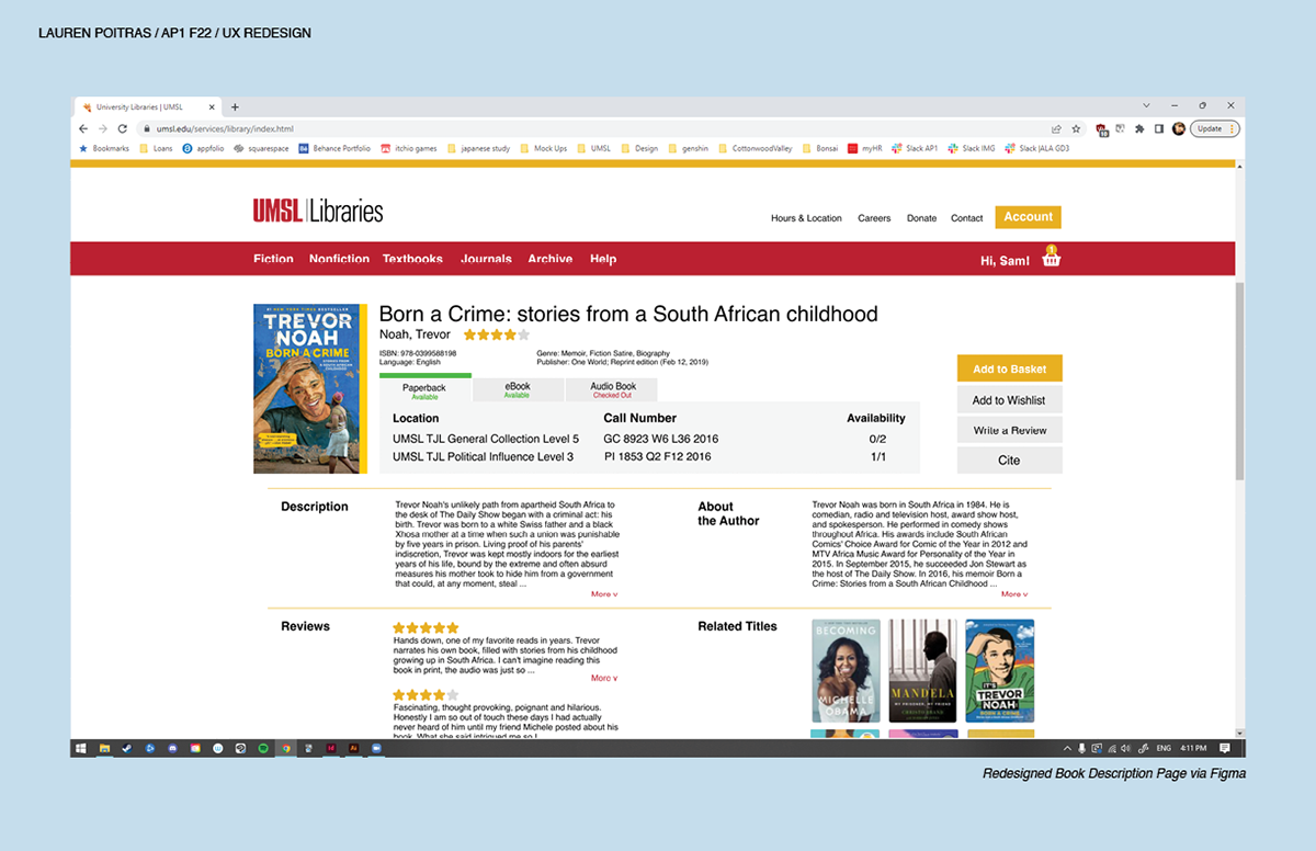
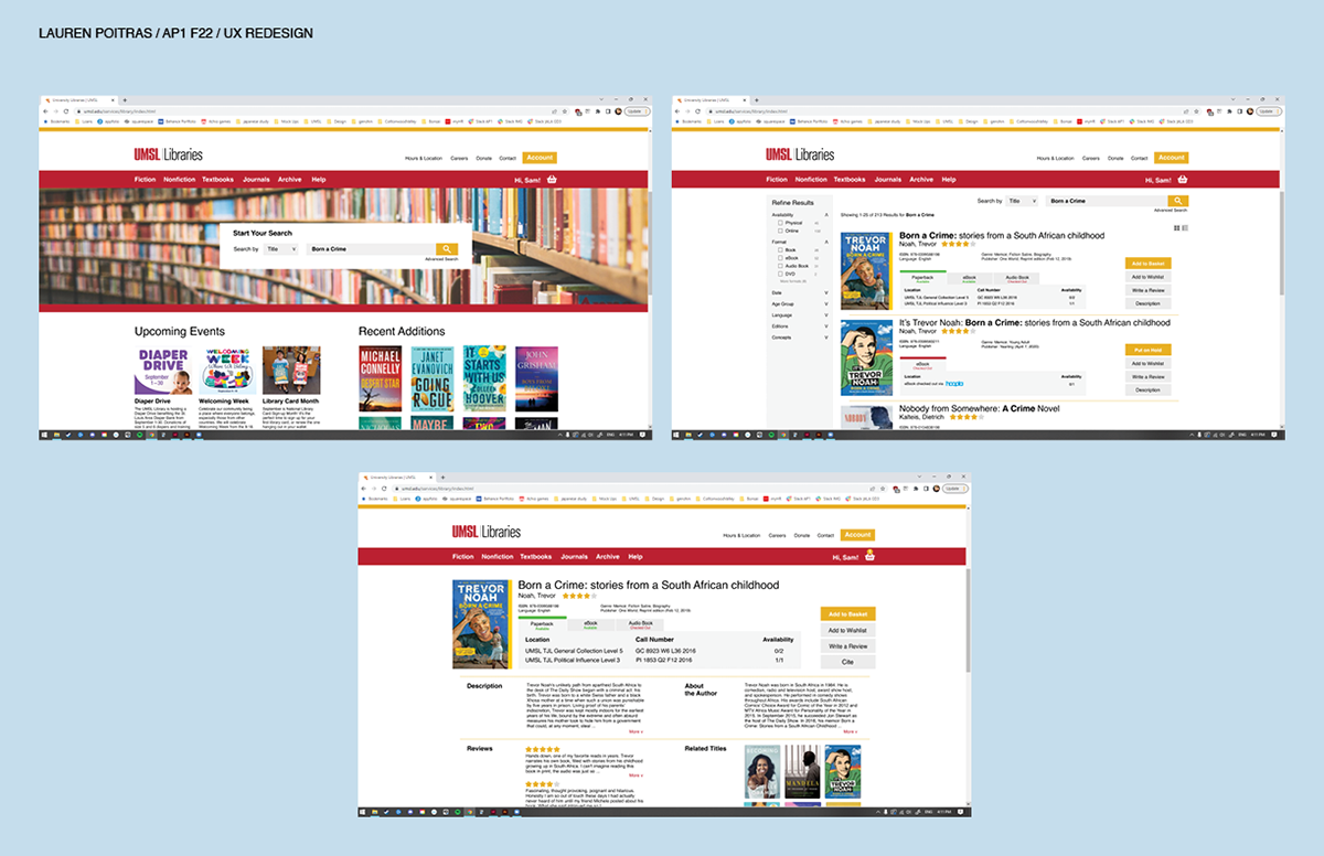
Overview - There is a need for a more obvious flow of check out and reservation options. Implementing of less
link clicks and page changes looking for information that is now promptly on screen and in view. Results are now
more streamlined and reader friendly, only displaying important information in the search results. There will be a
more obvious use of hierarchy to point out necessary information to the eye faster than previously. Less redirecting
allows for Sam's older computer to process the library website at a more manageable level.
